
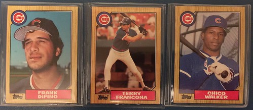
Specifically, the card's vertical color photo looked like a poster pasted to a wood grain board. The set features 598 standard size cards.
The biggest complaint that collectors have are the dark colors make damage show easily. The second biggest complaint? Quality control was HORRIBLE! I'm hardly the first person to write this. In the attempt to make better looking card with better posed players, everything else went out the window.
For example, four different cards were circulating with the same card number. Not only that, cards were not consistent on what they portrayed of the player. Many dual-pose cards were circulated. On a couple famous cards, the player's team logo appeared on his cap; sometimes it didn't. On other cards, the cap was missing entirely. There is a card were the ground behind the player is green, and on another card it is dirt. It's like they became aware of editing images and took it too far. Of course pre-photo-shop-era. I'm not aware of any of these issues though with Cubs cards.

I know over the years I have a lot of criticism for Topps. For very good reasons I believe. I still don't even believe that they deserve to be MLB's sole baseball card company. But Overall, the photo quality of poses in 1962 are much, much, better than the Topps 1961 series. The card design went on to inspire the Topps 1987 lighter wood grain cards.


No comments:
Post a Comment